esure
BRAND OPTIMISATION ・ UI TOOL KIT・BRAND GUIDELINES
esure was in need of a new visual identity as the current felt dated and had lost its personality and with no key brand elements. I had the opportunity to lead the design team and client on a journey while we defined the new modern esure.
My role
Creative Director
Leas UI Design
BRAND EXPLORATION
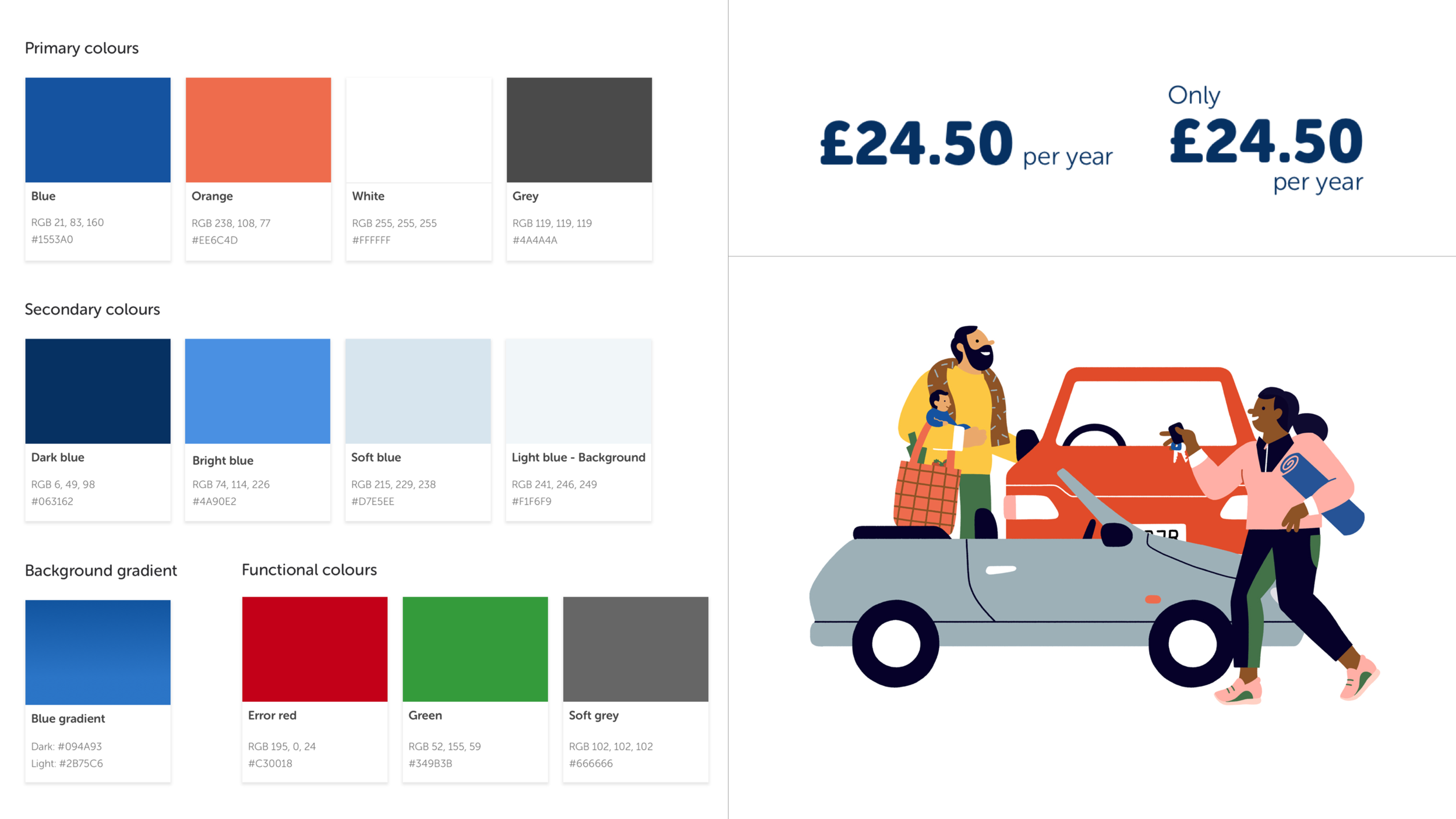
By running a workshop with the esure stakeholders we started to breakdown the brand as it was presented today. We quickly realised there was no ownable brand elements except the logotype the esure blue.
By starting fresh we allowed ourself to integrate what the opportunities there was for a new VI for esure.
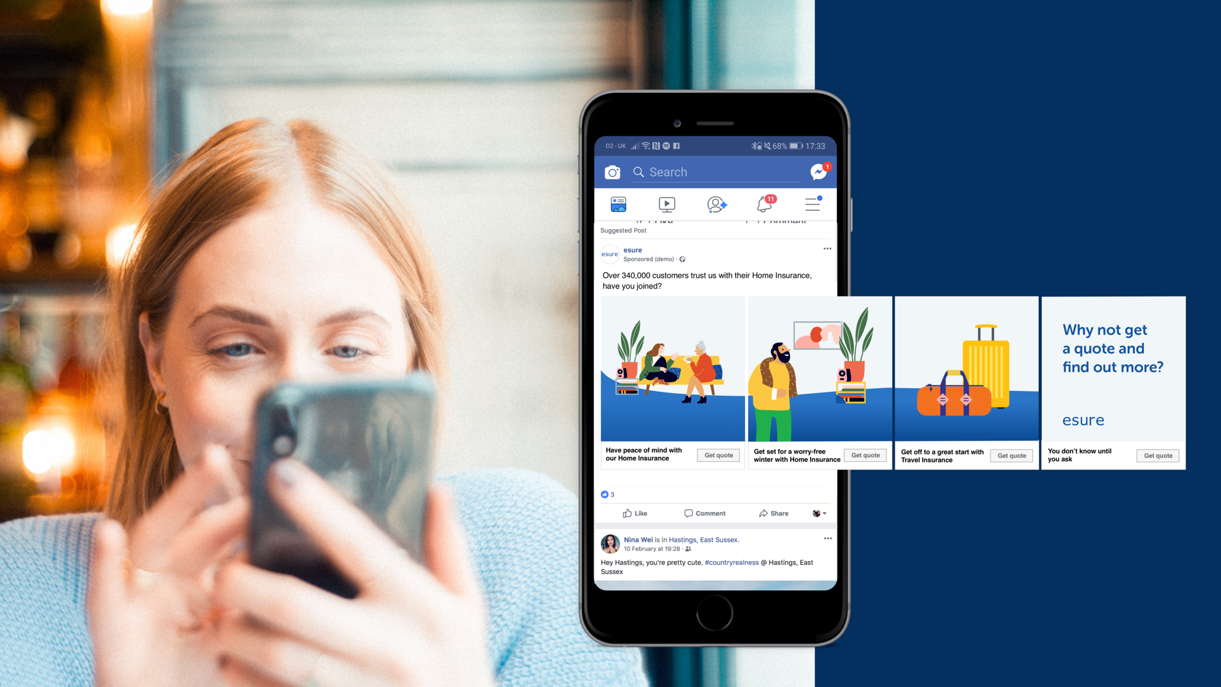
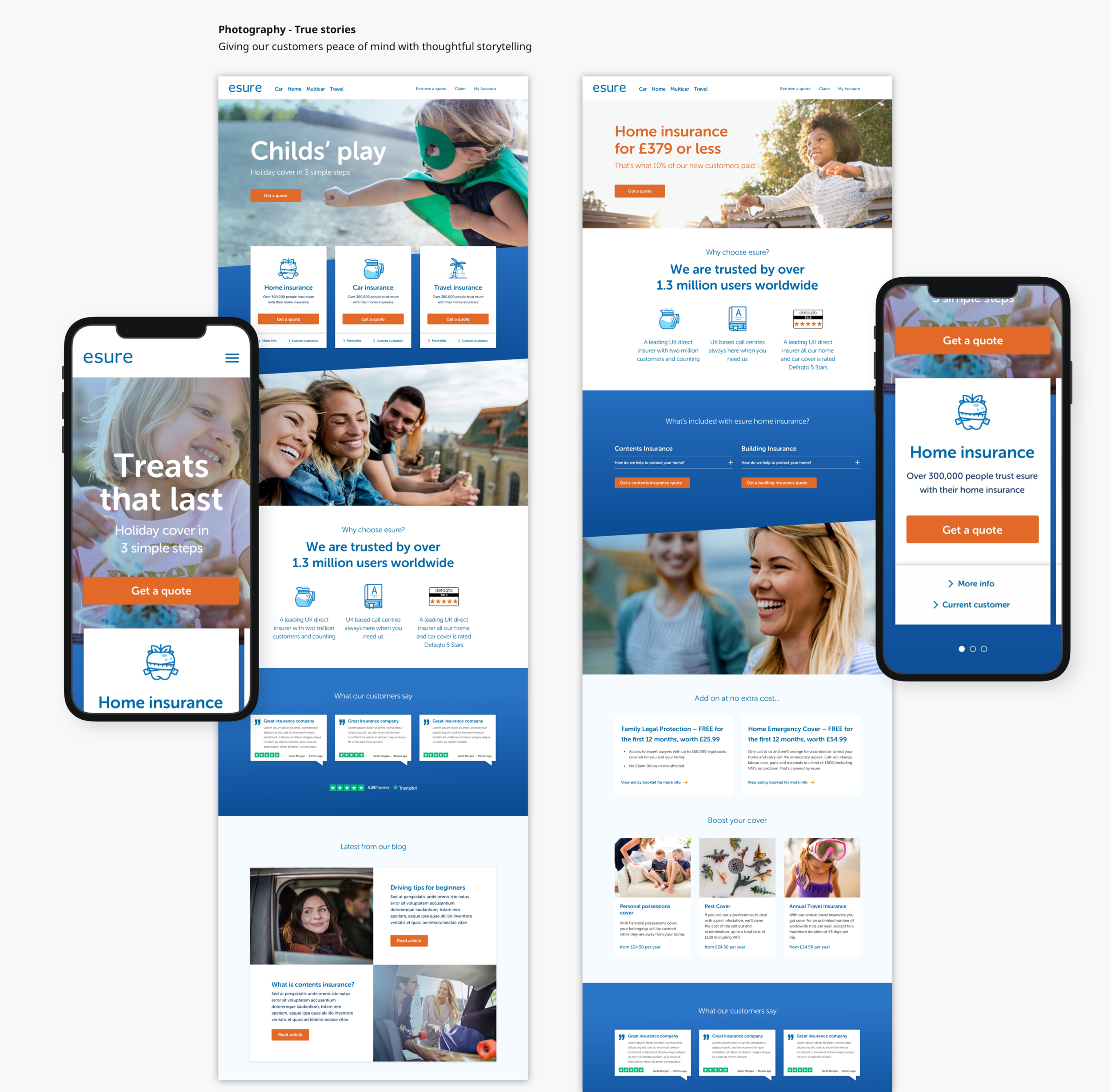
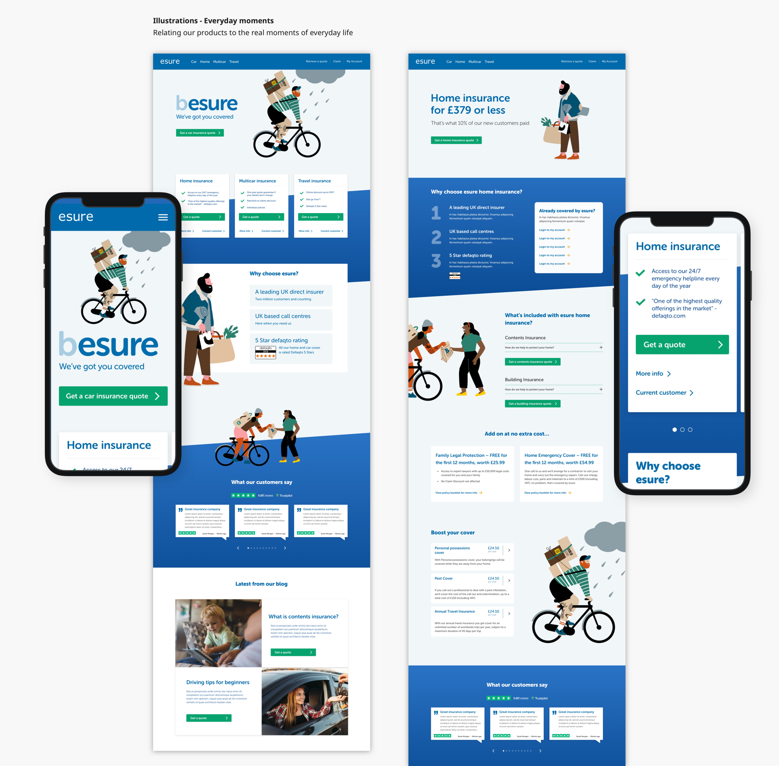
4 routes was created, two led with photography as it core brand assets and two explored the use of illustrations.


A NEW BRAND
esure favoured the soft illustration route and even fell in love with the example illustrations used in conceptual mock ups so we commissioned the artist to develop custom illustrations for the brand.

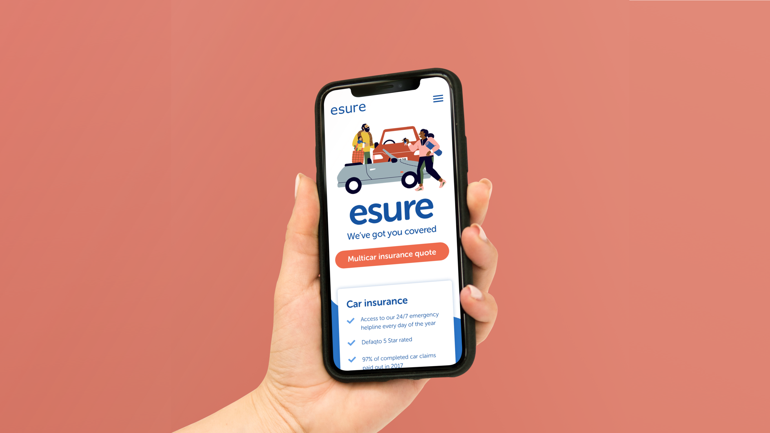
The new brand demonstrated how the esure products range support the customer in everyday life.
It uses literal illustrations featuring main products along side supportive illustrations in the same style. The new VI champions clear zooming and hierarchy to ensure the user clearly accessed key information.


‘Best Practice’ examples was created including example web pages for mobile and desktop, digital styles sheets, DM’s, social media posts, product and marketing emails and supporting guidelines.