

British Red Cross
DIGITAL BRAND DEFINITION ・ WEBSITE
The British Red Cross exist to create a world where everyone gets the help they need in a crisis. I led the creative team at Rufus Leonard to enhance one of the world most recognised brands for the digital age.
My role
Creative Director
Lead UI Design
Awards
Transform Awards Europe 2019 - Silver for Best Rebrand of a Digital Property

BACKGROUND
Over time The British Red Cross website had grown too big reaching more than 4,000 pages. It was confusing to use and the look and feel was outdated.
The challenge was to not only design and build a better website, but to create a digital experience that showcased the British Red Cross putting kindness into action whilst allowing users to quickly find the information they are looking for.

CREATIVE CONCEPT
The British Red Cross brand itself was under brand enhancement development which allowed us to work collaboratively with their brand agency. This allowed us to influence fundamental design decisions required for a digital first brand.
The development of two conceptual concepts allowed British Red Cross and the Rufus Leonard design teams to define the digital design direction.

DEFINING THE DIGITAL PALETTE
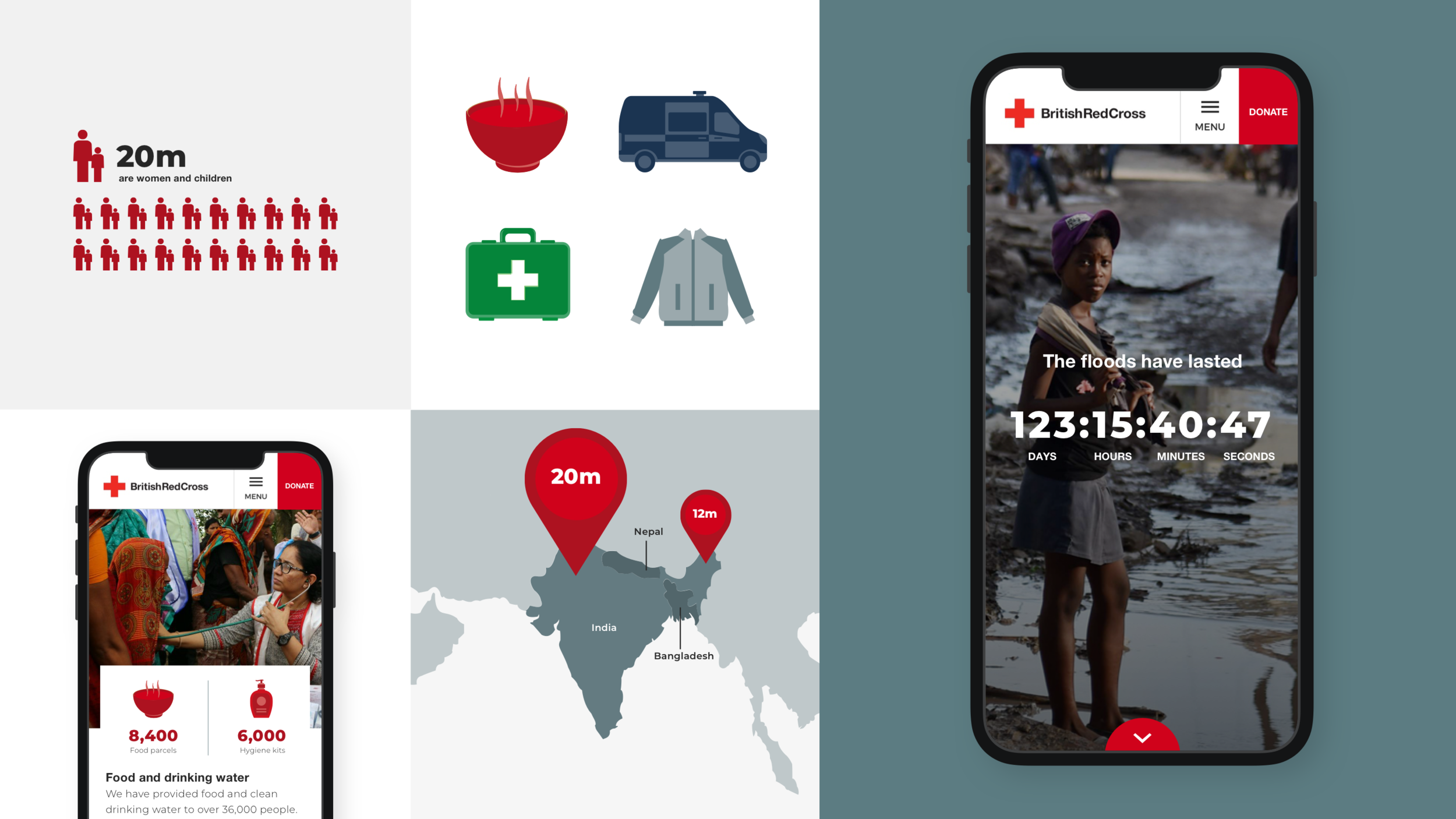
Influenced by the recognisable and striking Red Cross emblem, we developed an attractive digital language that was based on a white canvas and where elements and content can be built upon with a mobile and content first experience.
Red is used to highlight key actions and green to encourage discovery. Images used are people centric to show the connection between those in crisis and the British Red Cross supporters.


TASK-FOCUSED AND INCLUSIVE DESIGN
With a thorough understanding of the diverse target audience and their needs, we created a website that was inherently task-focused. With content that promotes clarity and uses storytelling to motivate action, we made the new experience inclusive and accessible, specifically for those in need at a time of crisis.

CLEAR SIGNPOSTING
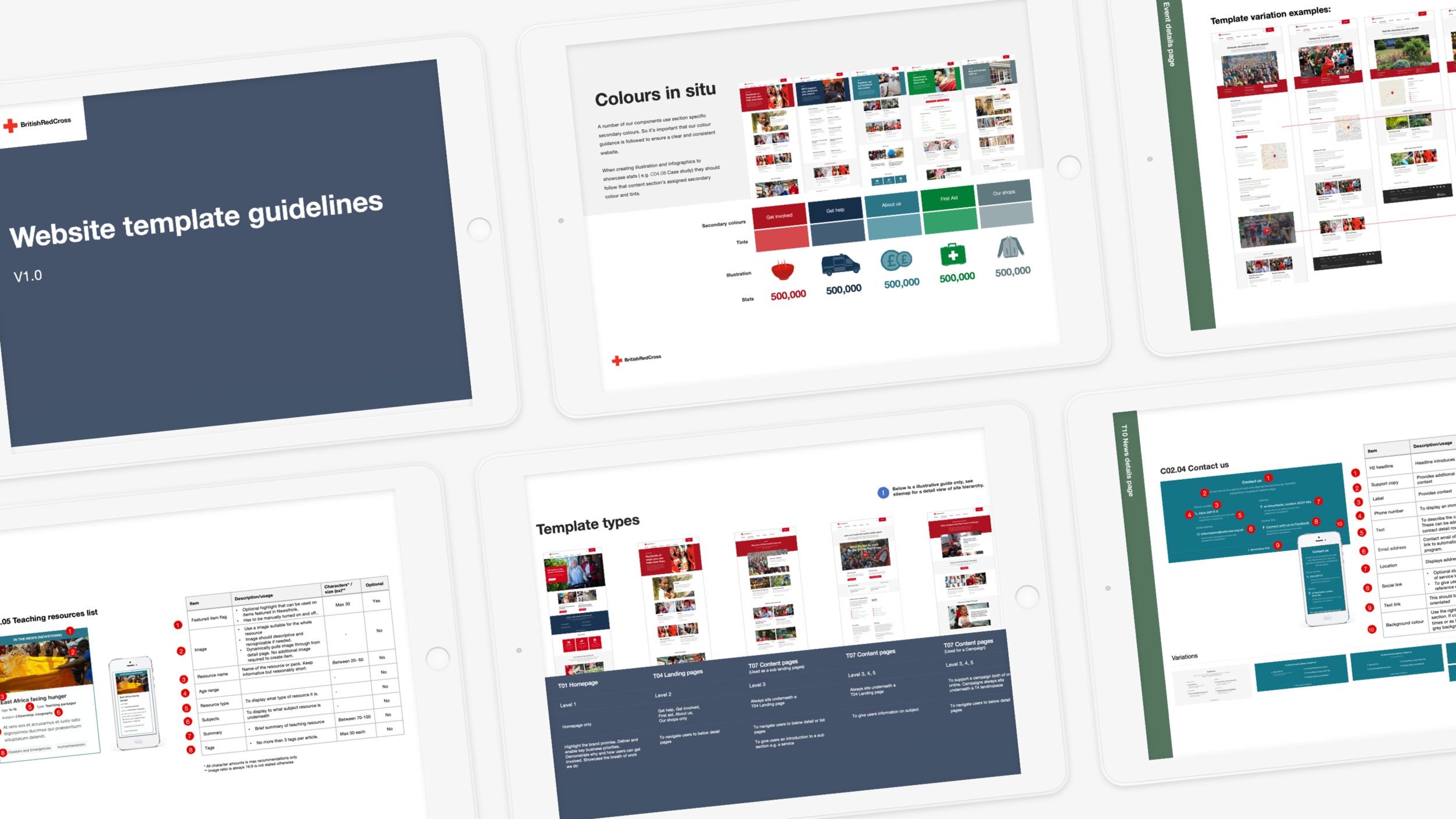
A rich secondary pallet was developed which we used to efficiently colour code sections and content on the website. The pallet also allowed the brand to enhance its visual appeal.

READY TO GO LIVE
Throughout the project we worked collaboratively in blended teams with the British Red Cross digital team. This allowed us not only to run weekly user testing with the British Red Cross user testing volunteers. It also allowed us to work with go live ready content whilst developing the design and experience solutions for templates and components.
Throughout the build, which was also carried out by Rufus Leonard, we supported the client throughout the migration of content by creating handy ‘how-to’ guides.
Results
13.5%
Increase in mobile donations
17.4%
Increase in tablet donations
20k
Pages audited
74
Services consolidated into 7
“Working together with Rufus Leonard not only helped us move more quickly; it enabled us to bring knowledge back to the British Red Cross, put the customer at the heart of what we were doing and ultimately we delivered a web site that we are all very proud of. A true collaborative approach with agency and client seamlessly integrated.”
— Rosie Slater-Carr - Chief Information Officer (CIO) at British Red Cross